At Barnabé Studio, we craft striking designs that capture your story and resonate with your audience.
CITY OF PASADENA MARKETING CAMPAIGN PROPOSAL
Branding, Graphic Design, and Illustration by Barnabé Studio
Marketing Direction by The Social Impact Firm
Stock photos used in presentations.
Year
08/2024
Client
Barnabé Studio collaborated with The Social Impact Firm to develop the branding, graphic design, and illustration for the City of Pasadena’s Carbon-Free Campaign proposal. This initiative aimed to create a compelling visual identity and a strategic social media presence to promote Pasadena’s transition to clean energy.
Guided by The Social Impact Firm’s marketing direction, Barnabé Studio crafted a cohesive brand identity that aligned with the campaign’s sustainability goals. From logo design to digital assets, our work helped shape a modern, engaging proposal that effectively communicated the campaign’s vision to the community.


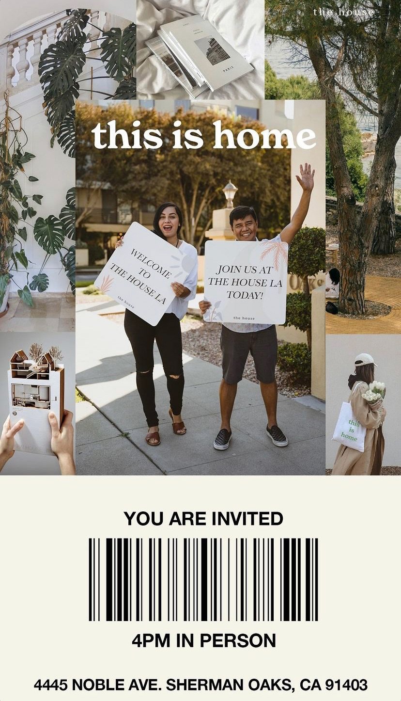
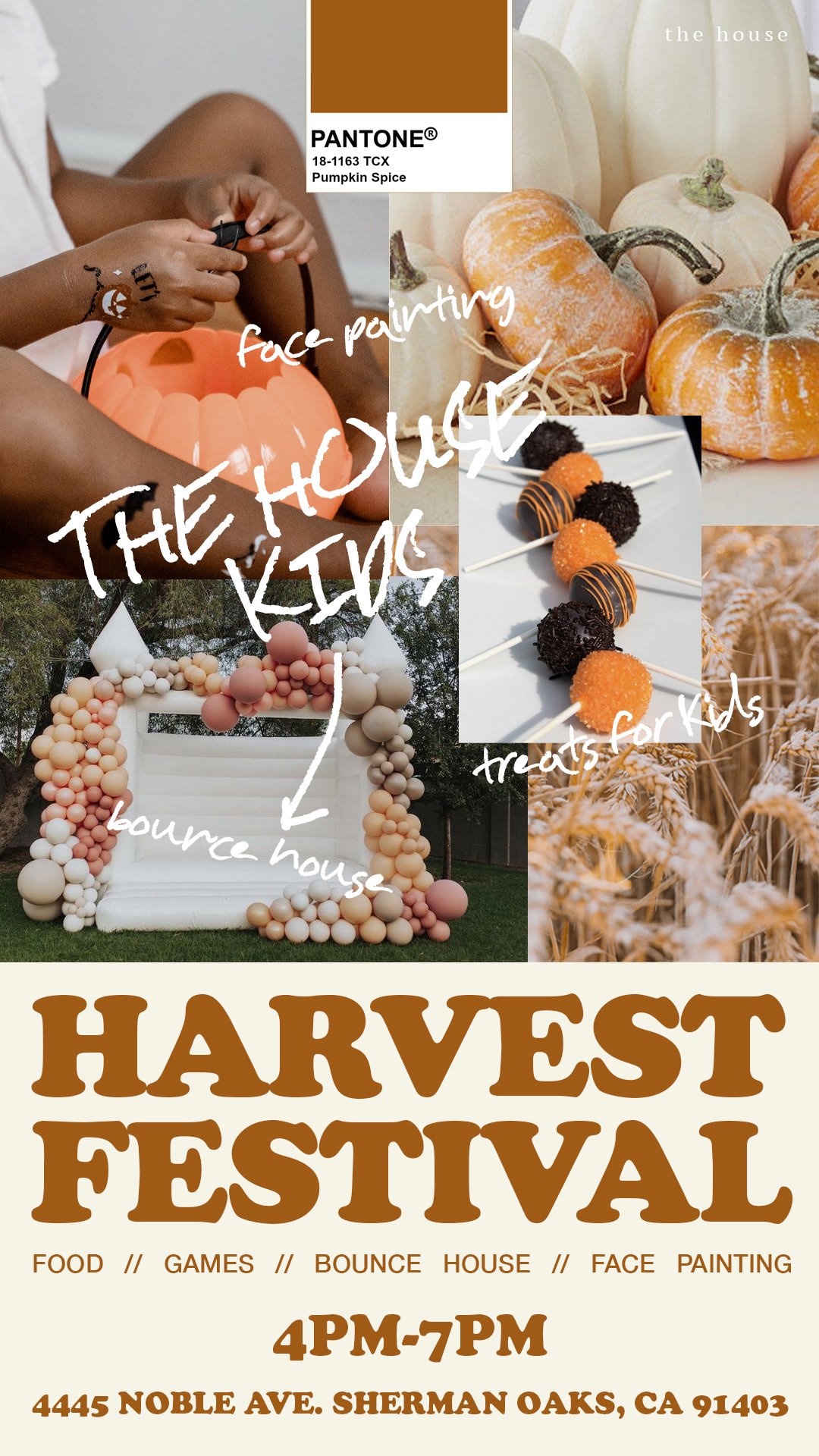
event branding, flyers, & billboards
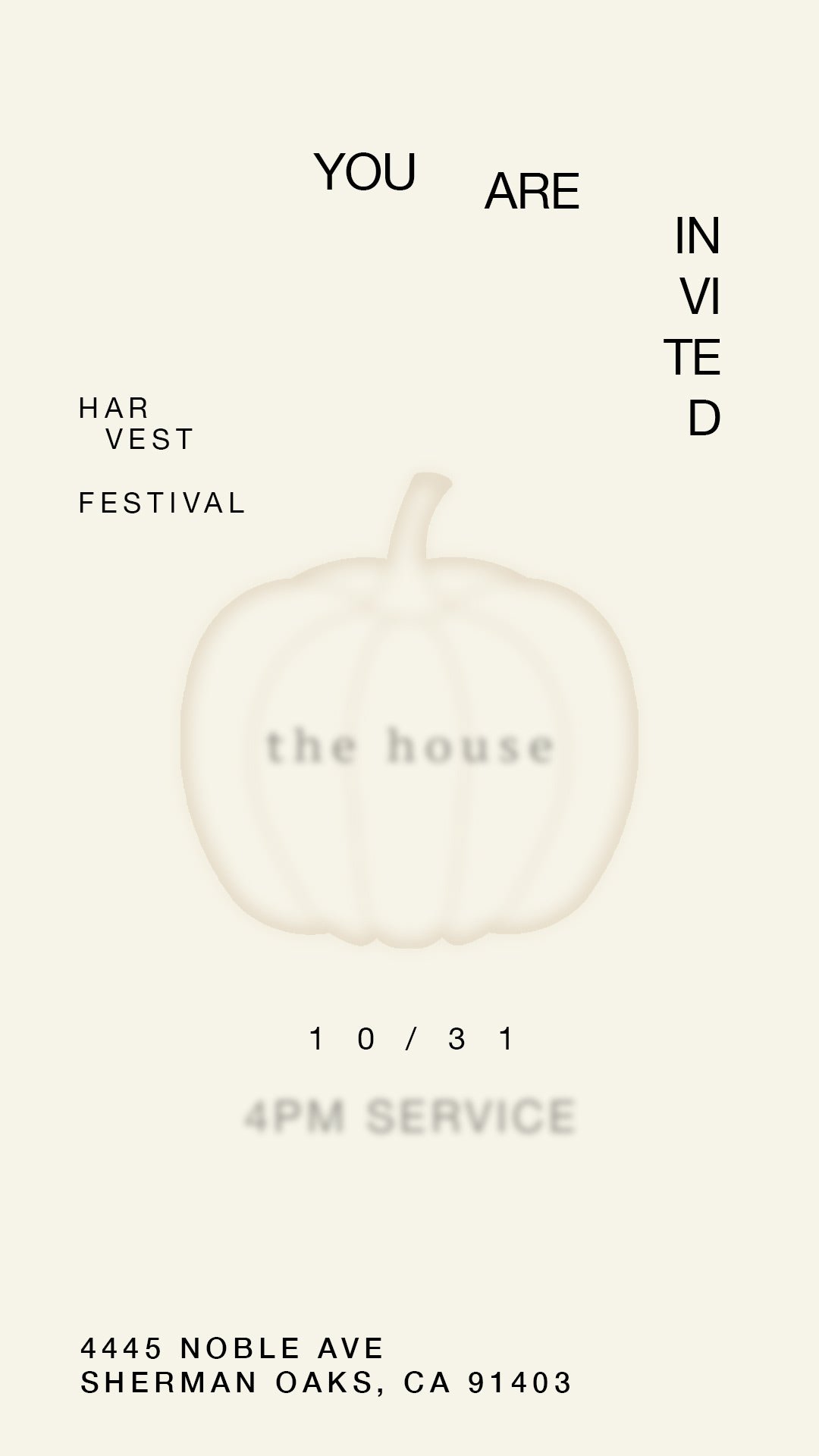
Client
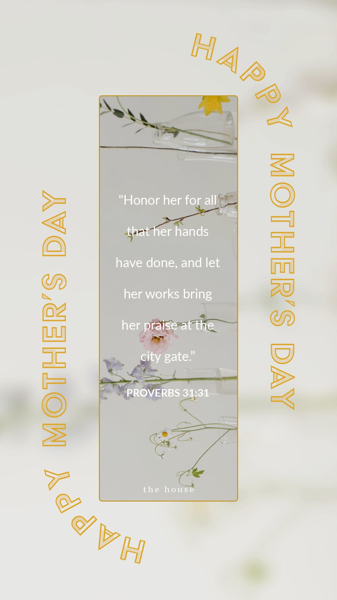
The House Easter
Year
03/2023
These Easter campaigns were developed for The House church based on a creative direction provided by the client. They typically guide the visual tone, including preferences for bright, playful color palettes and specific illustration styles that reflect the joyful nature of their events.
My role was to take those creative inputs and translate them into a cohesive campaign across multiple platforms — including billboards, printed flyers, and digital graphics — ensuring consistency in layout, messaging, and visual flow.


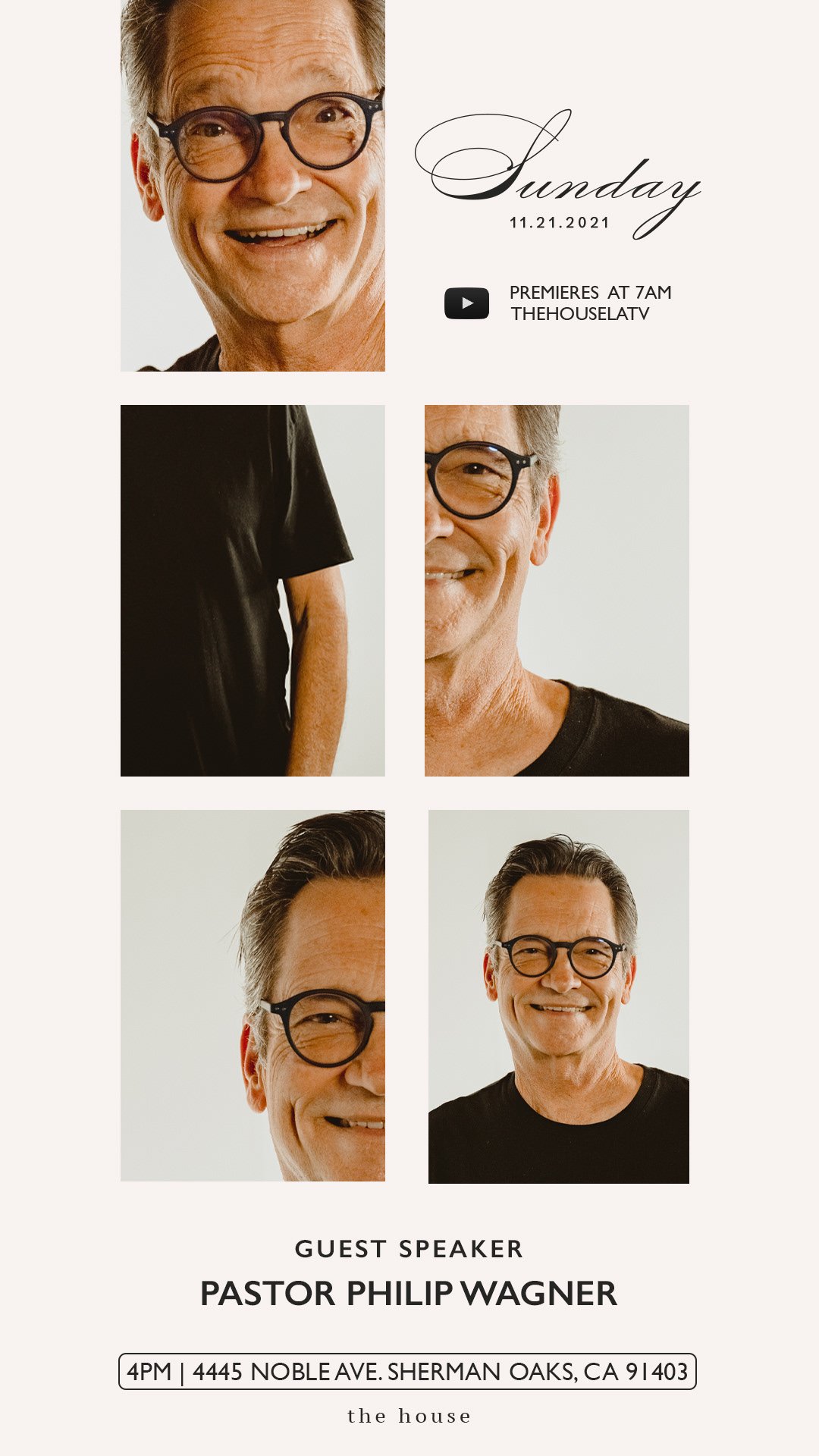
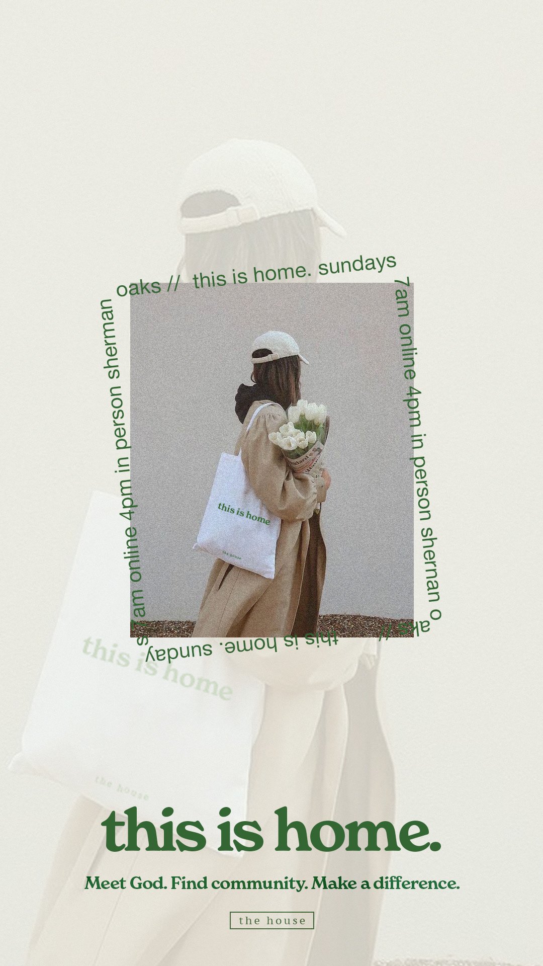
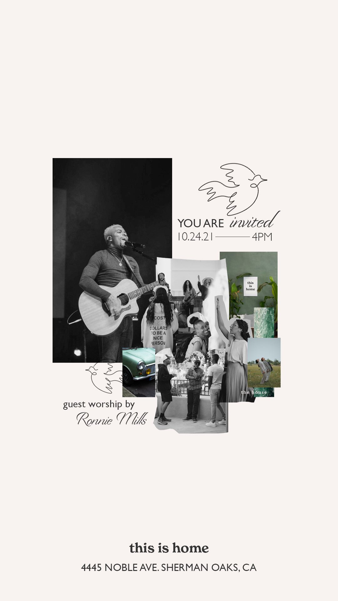
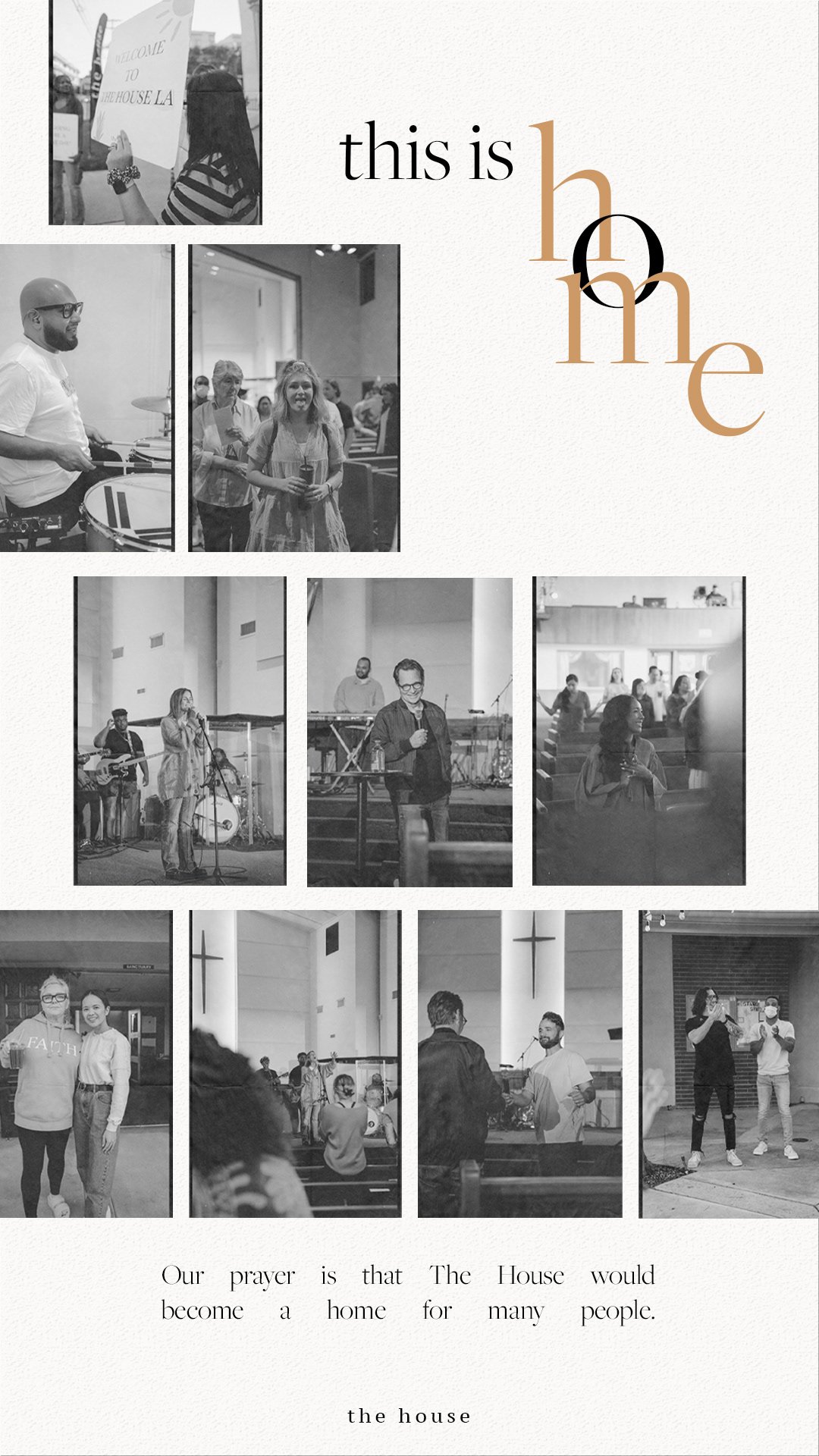
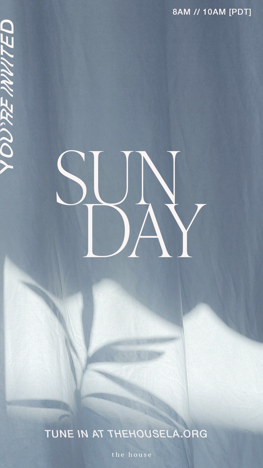
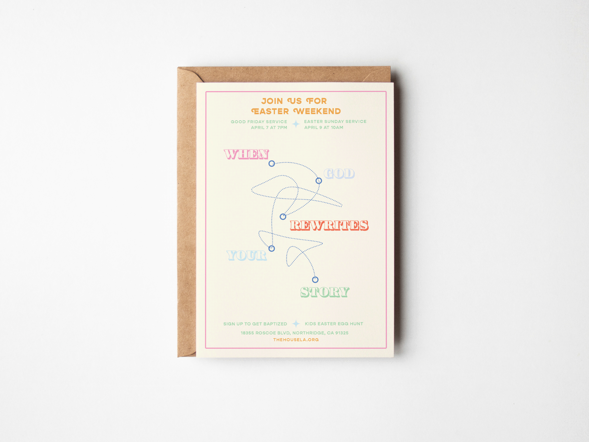
Client
The House Easter
Year
03/2025

Client
Madelina Elizabeth
Year
03/2024
book cover design
Living in God’s Fullness is a 30-day devotional designed to help readers grow closer to God and hear His loving voice. The design process centered on creating a peaceful, clean, and uplifting experience — visually and spiritually.
The client envisioned a nature-inspired theme that reflected stillness, connection, and spiritual growth. They specifically requested tree illustrations and a calm, minimal aesthetic. I translated this vision into a hand-drawn line art cover paired with modern, elegant typography.
This project included:
A minimalist, tree-focused cover illustration based on the client’s request, symbolizing peace, growth, and rootedness.
A timeless design approach that aligned with the devotional’s heart: drawing near to God through stillness and presence.

social issue awareness campaign
This piece was created as part of a graphic design project focused on raising awareness about the global issue of child trafficking. The goal was to use bold, minimal visuals and a strong message to advocate for change and spread awareness in a way that is both eye-catching and thought-provoking.
The orange color palette was chosen to symbolize urgency and hope — it stands out while remaining warm and human.
The composition uses intentional white space and clear typography to keep the message front and center.
Illustrative elements suggest innocence and vulnerability, contrasted with bold text to call for protection and action.
branding / photography / illustration
For artist Alyssa Foley’s single releases Pull Me Close and The Psalm, I was brought in to create a visual brand identity that reflected the emotional tone of her music. Alyssa had a strong creative vision — she wanted artwork that visually aligned with her lyrics through meaningful illustration.
My contributions included:
Promotional photography for use across Spotify, YouTube, and social media platforms
Cover art design for each single, using custom illustrations layered with stock photography backgrounds
Visual storytelling through line work and composition to match each song’s atmosphere
The result was a cohesive artist aesthetic that elevated her presence across all digital platforms and connected deeply with her audience.

Client
Alyssa Foley
Year
01/2024


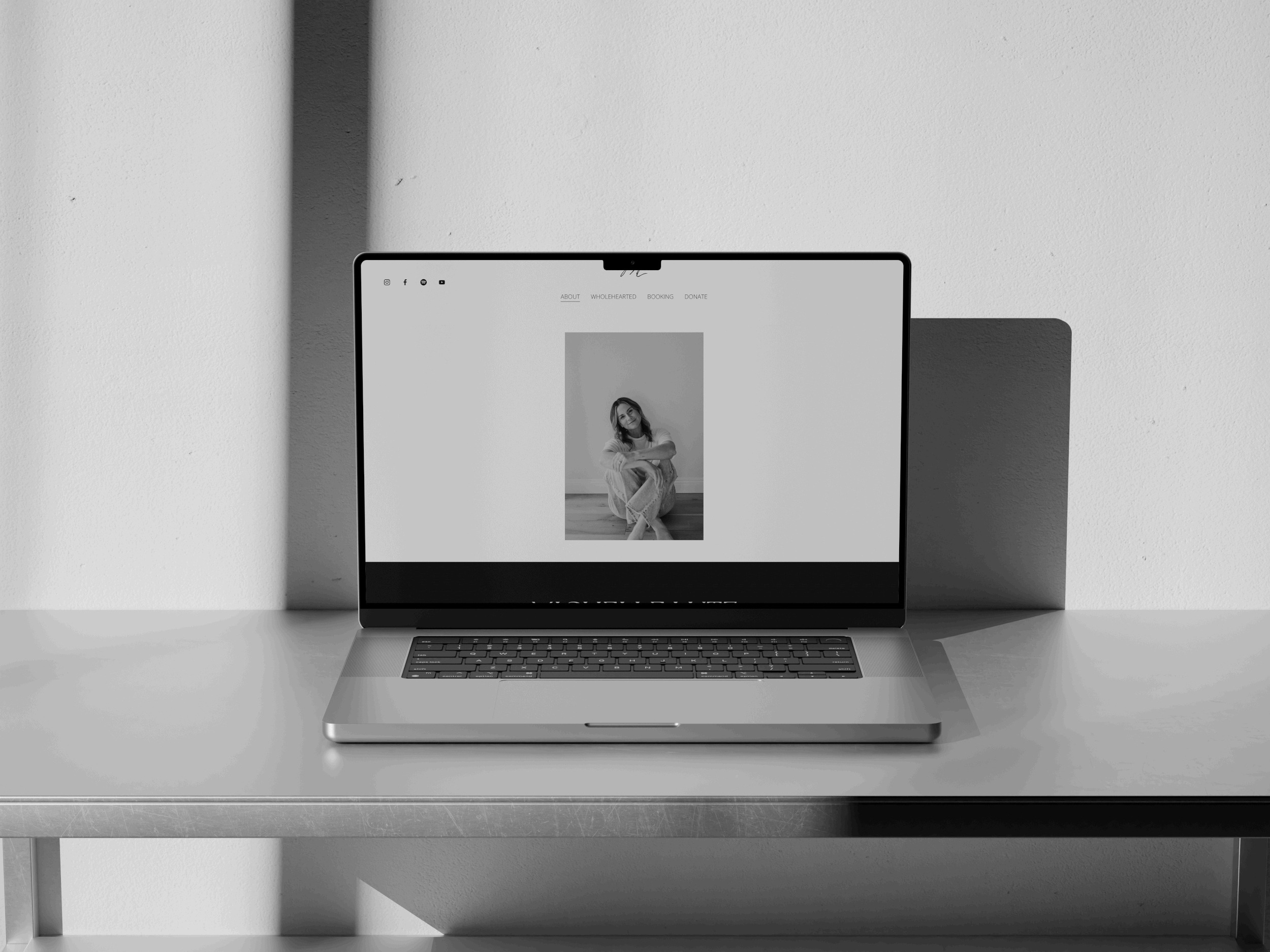
web update / branding
Client
Michelle Lutz
Year
03/2024
ull creative direction and design support for the single The Father’s Love. The artist requested a hands-off experience, entrusting Barnabé Studio to shape the entire visual identity for the release.
The project included:
Creative concept development based on the song’s heart and message
Cover art design with a focus on warmth, faith, and intimacy
Website updates to align the artist’s online presence with the new release
Lyric video design for YouTube and social media rollout
This end-to-end project allowed the artist to focus fully on the music while Barnabé Studio created a cohesive and timeless visual campaign across all platforms.